
Cooper Pop
This campaign had a specific emotional brief: to make optimism feel tangible at a moment when the world badly needed it. The creative solution was built around colour — not as decoration but as a structural decision. By matching hand-painted backdrops to the exact heritage hues of each garment, the cast appeared to emerge from their own environment, dissolving the boundary between person and palette in a way that felt genuinely joyful rather than merely graphic.
As Creative Director, I developed the "studio-in-the-wild" concept and directed the full on-set execution — building the monochrome-on-monochrome technique through meticulous colour matching and a late-summer, sun-saturated light. The diverse cast was directed to feel unaffected and at ease within each vivid environment, ensuring the campaign's energy read as lived-in rather than constructed.
Brand: Roots Canada.
Role: Creative leadership, omni-channel strategy, on-set direction, creative concept, copy direction and brief.
Seen: Roots.com, social channels, emails, in-store and window.
Credits: Photographers: Zach Hertzman.




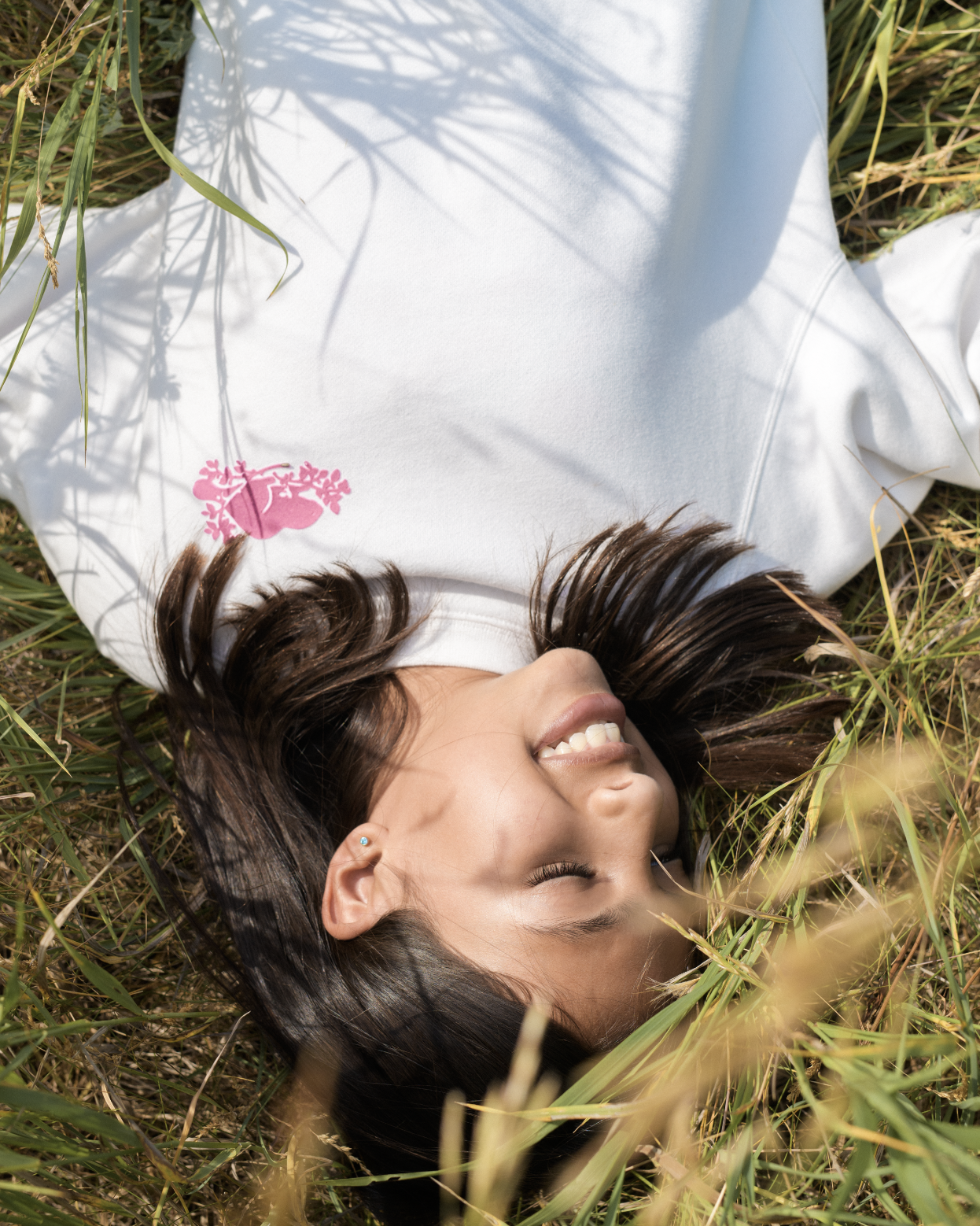


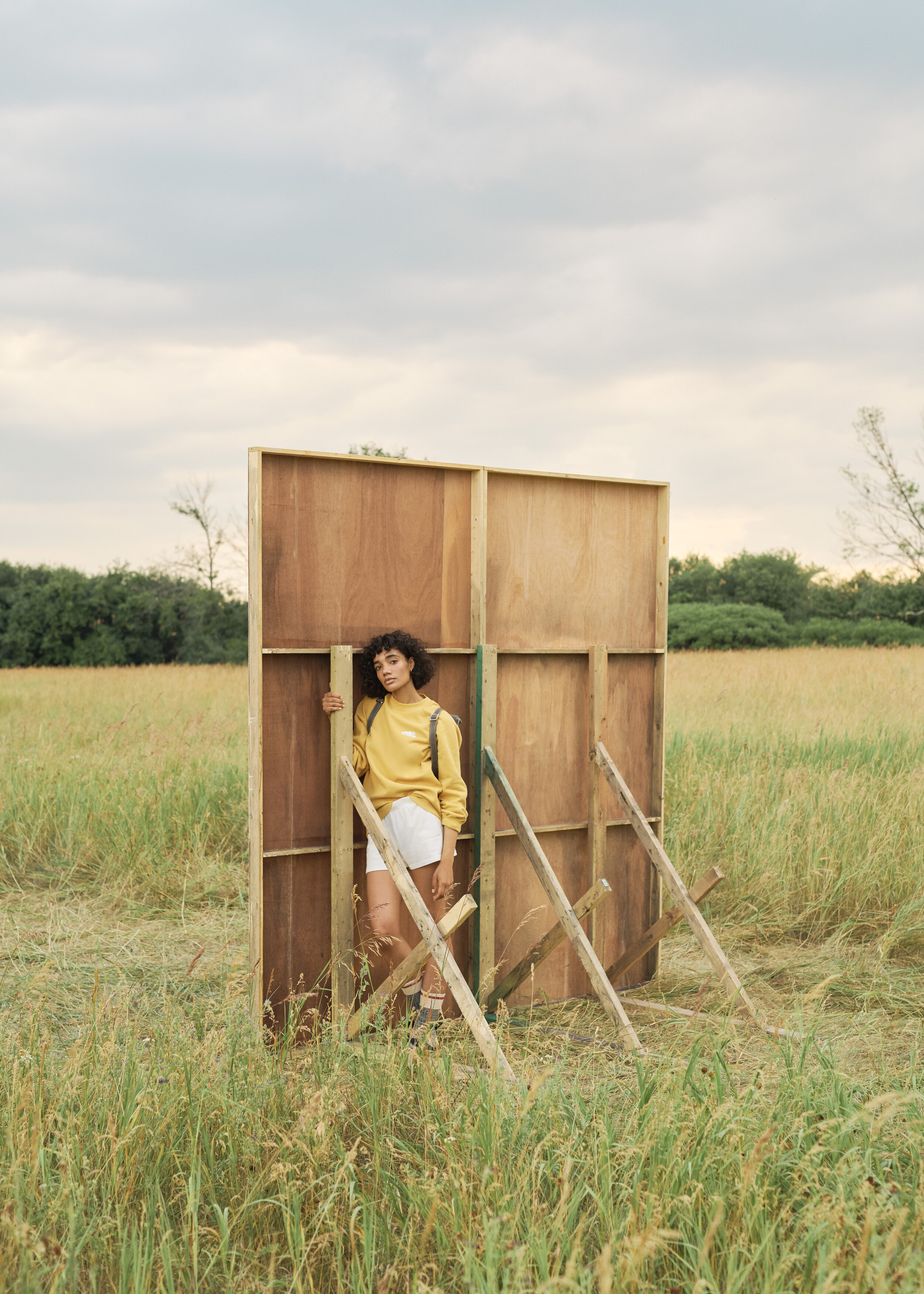
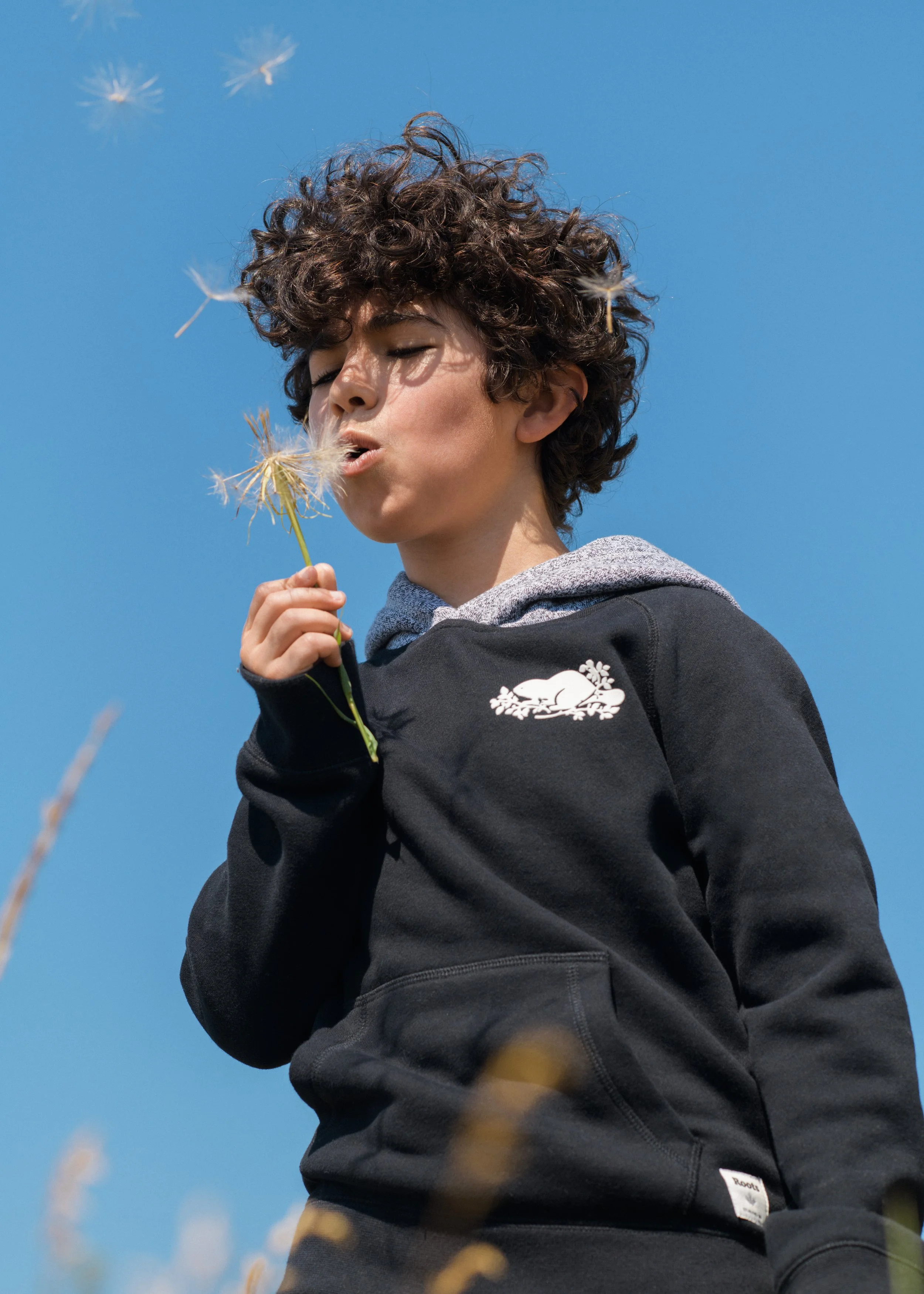
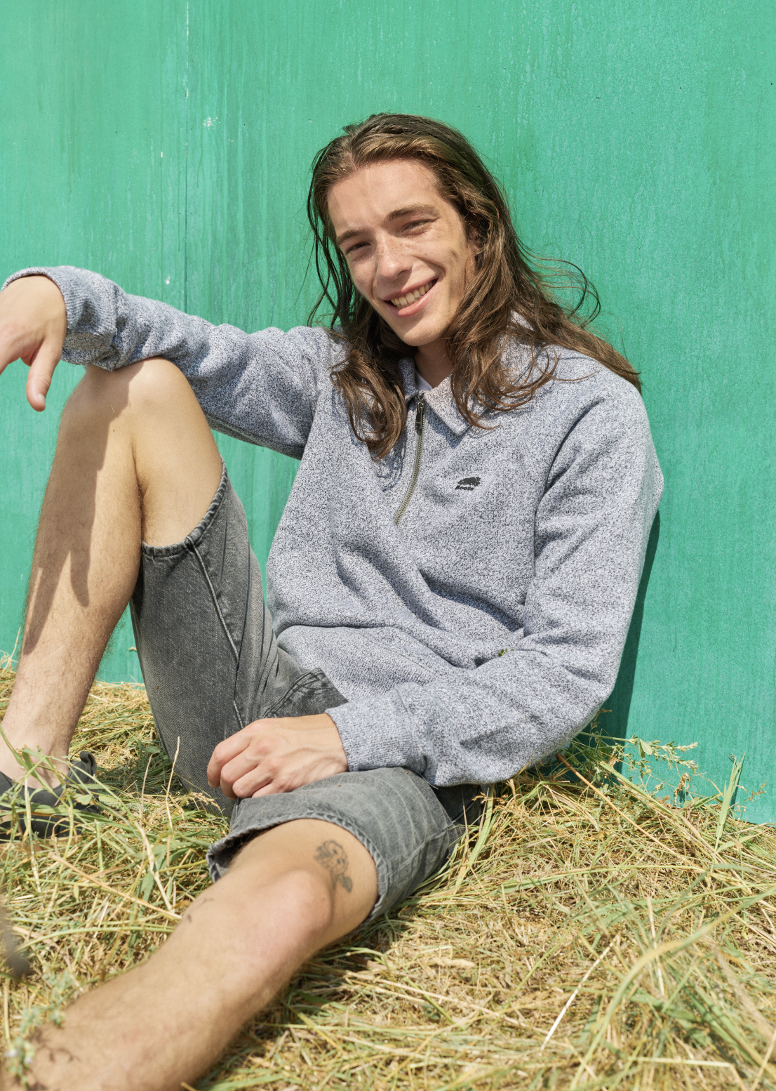





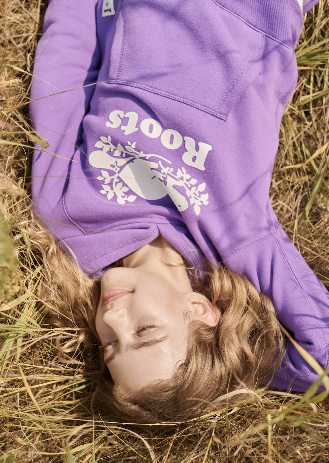
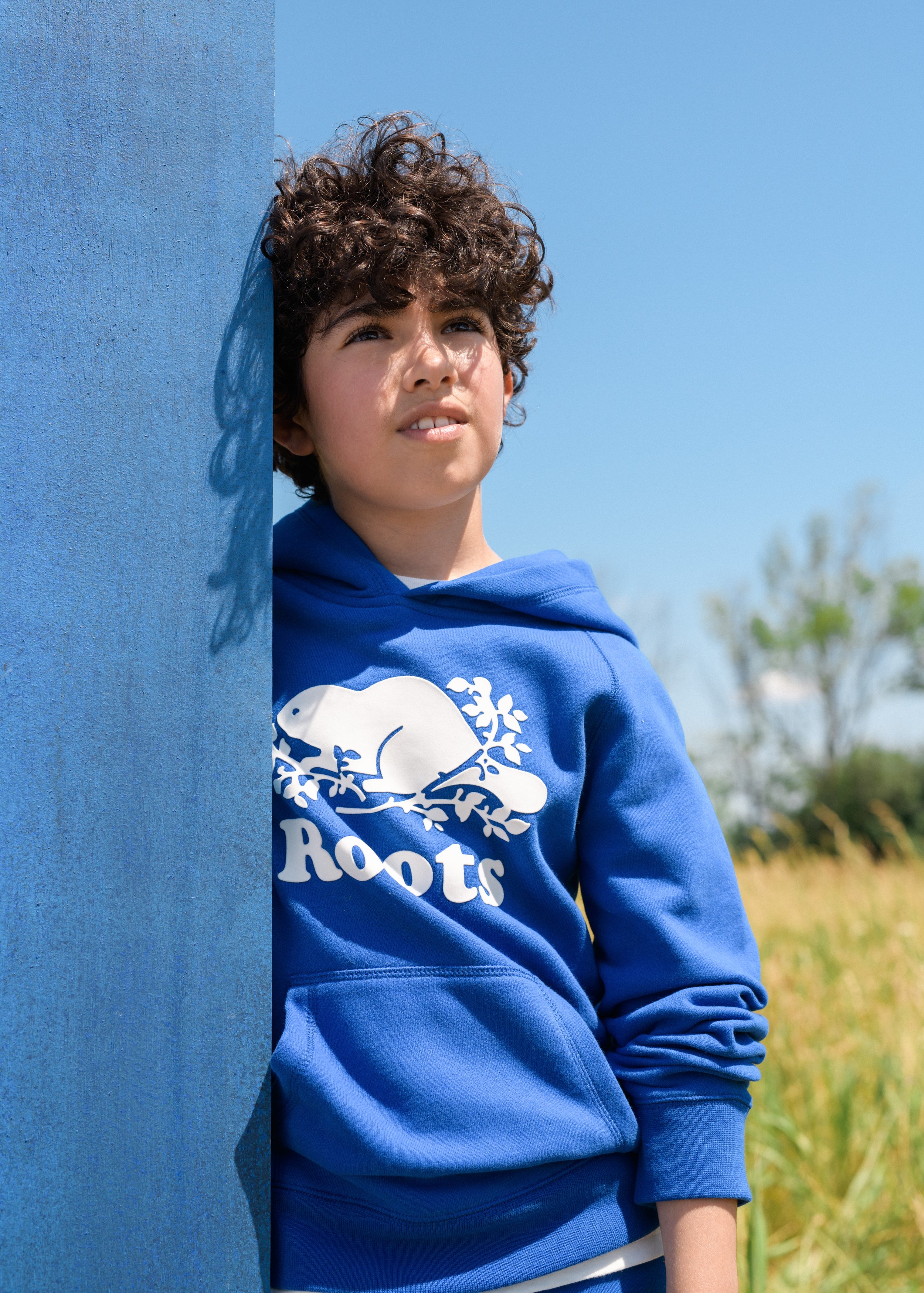


"Optimism is a visual construct. By intersecting the bold, athletic DNA of our heritage with a modernist, graphic editorial aesthetic, we transformed a signature collection into a dimensional study of form and space — celebrating the power of vibrant, saturated colour through a cinematic lens that honours the sophisticated tension between the studio and the open air."
— Campaign Thesis
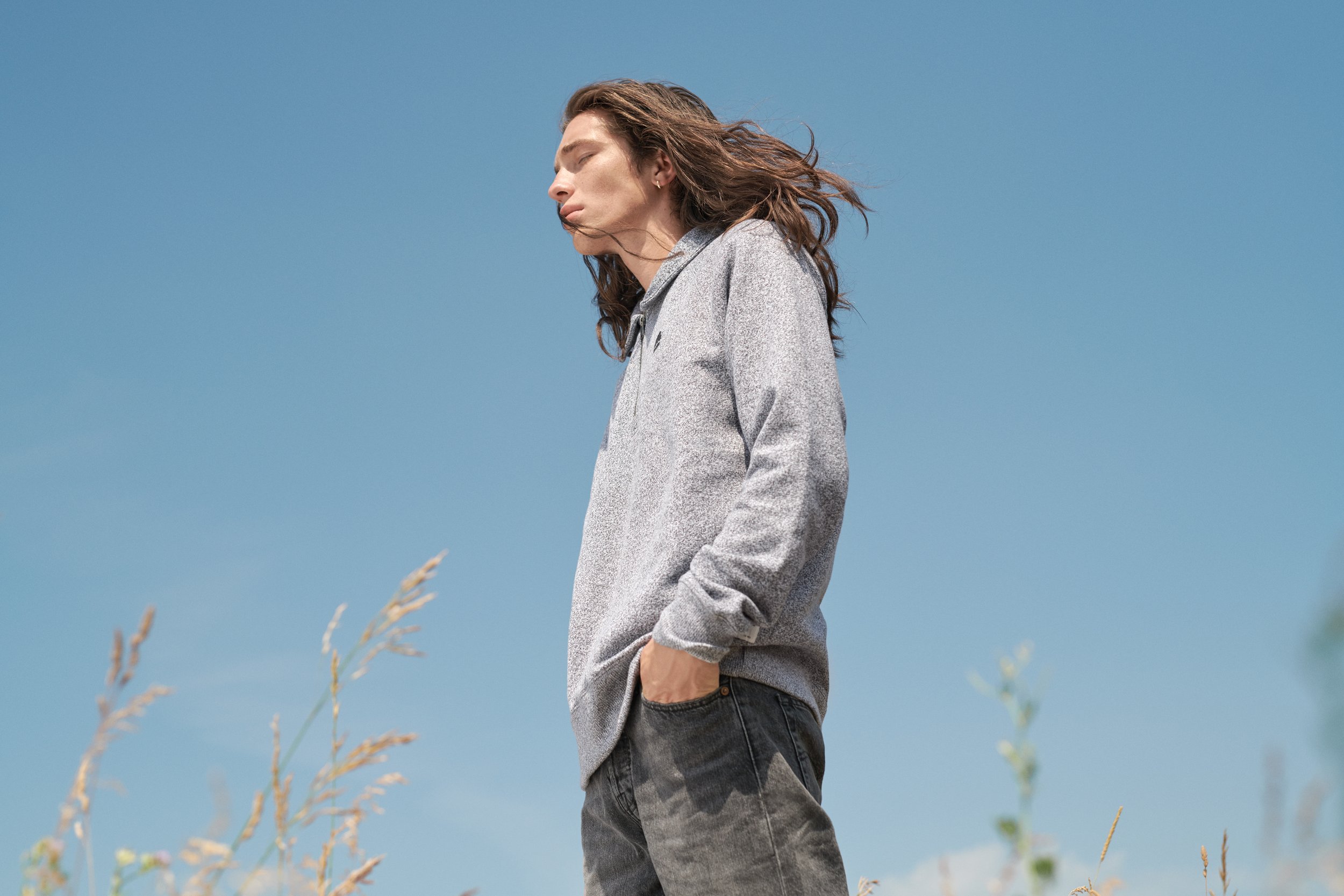

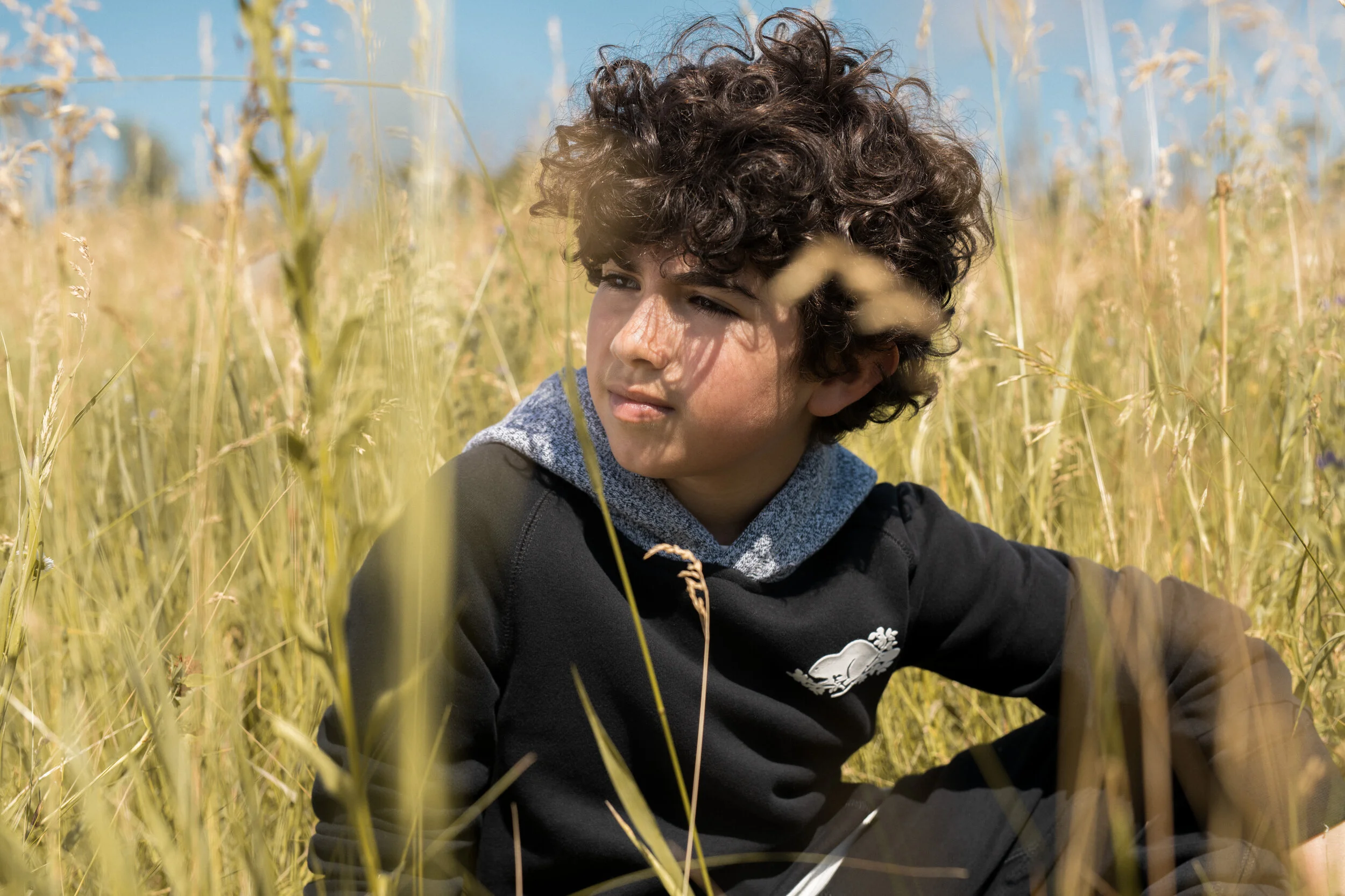

Homepage Layout