Cooper Pop
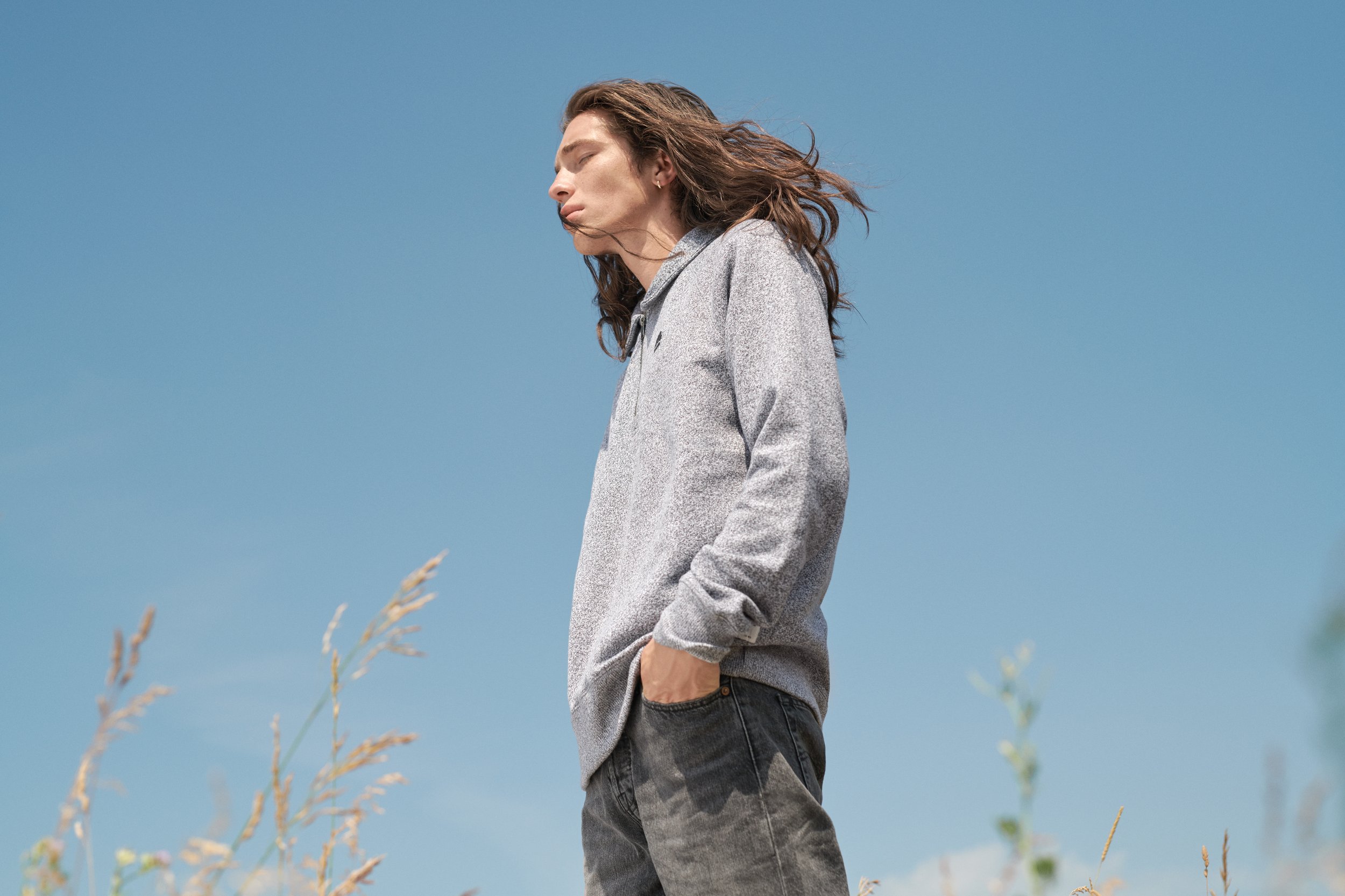
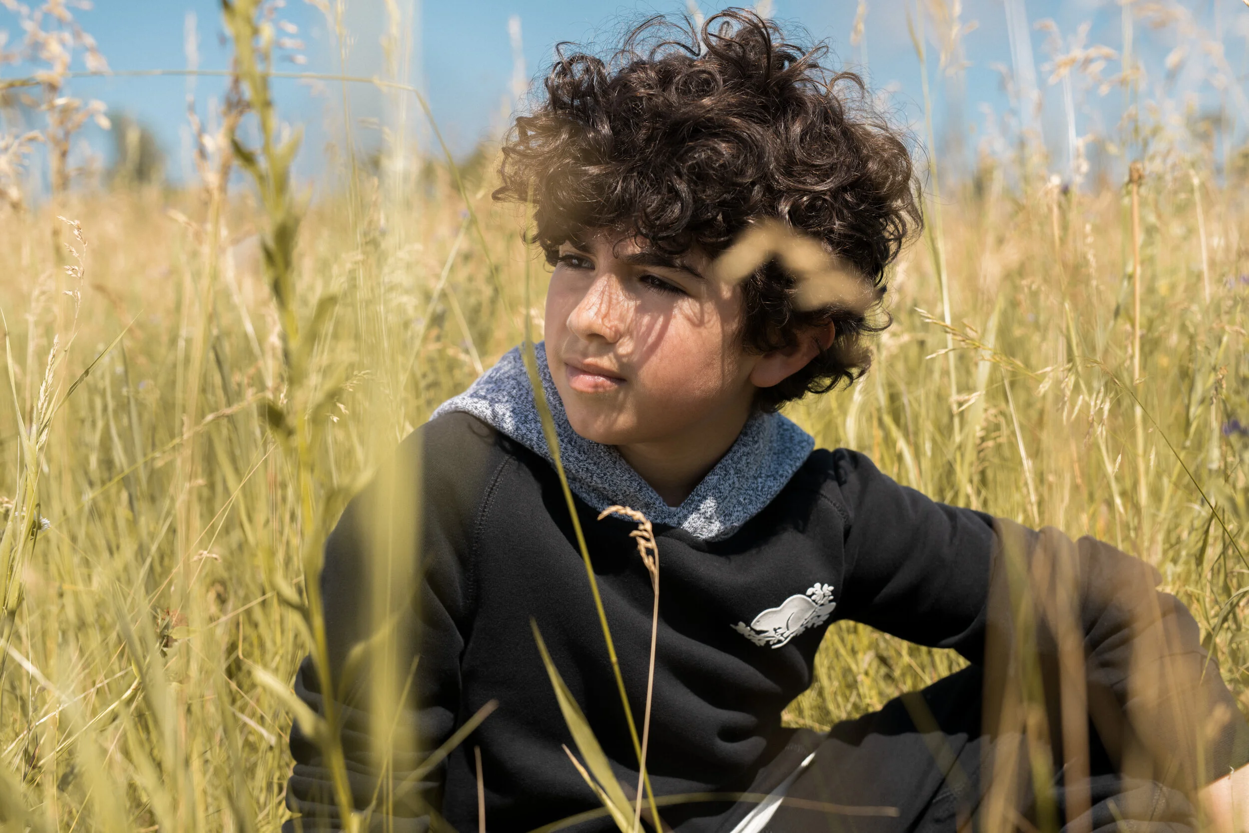
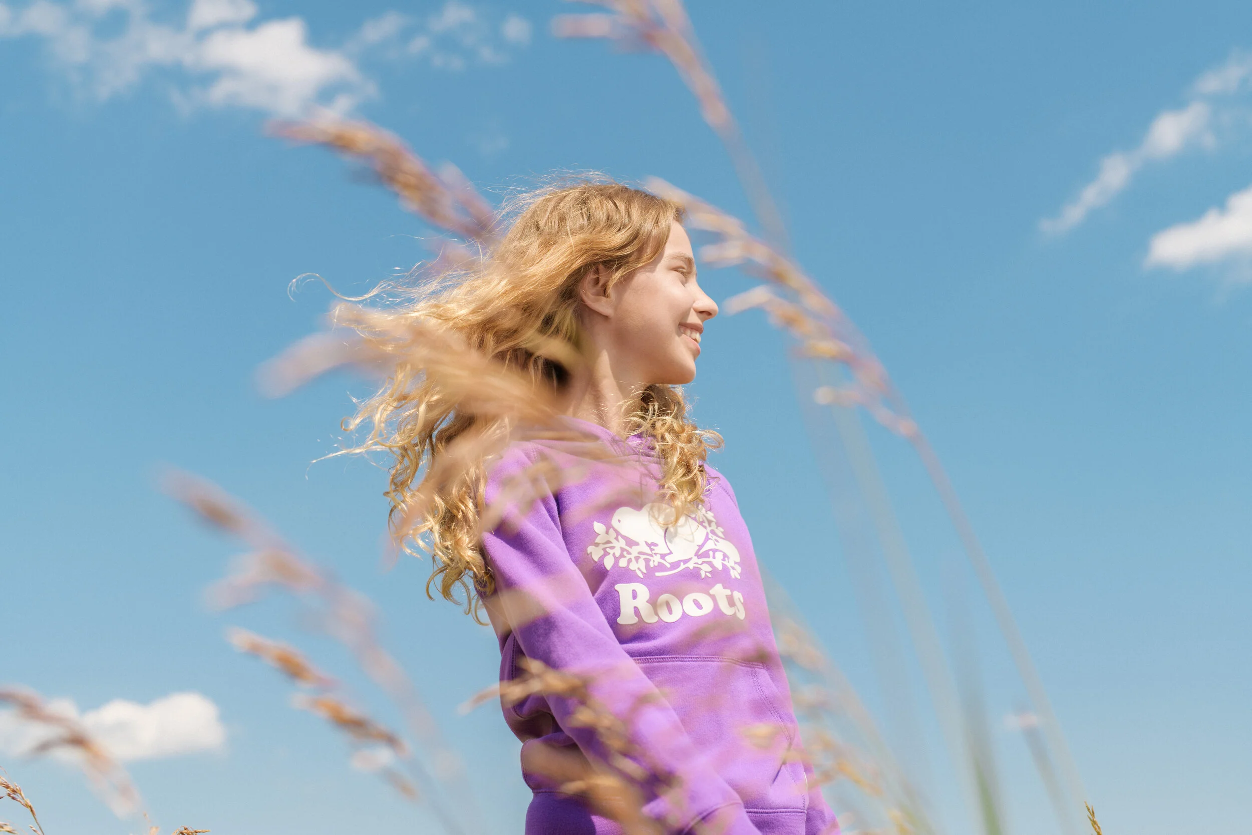
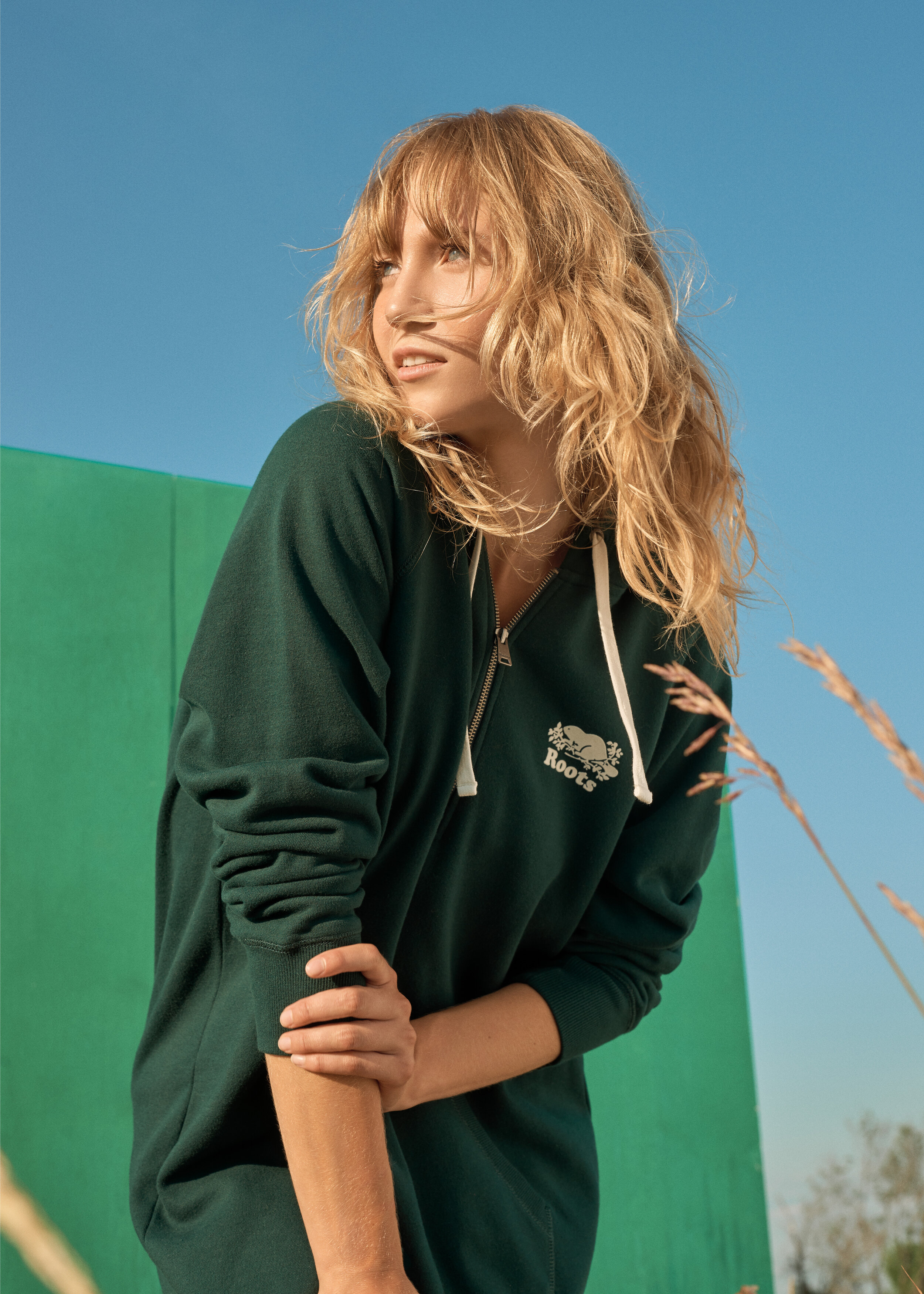
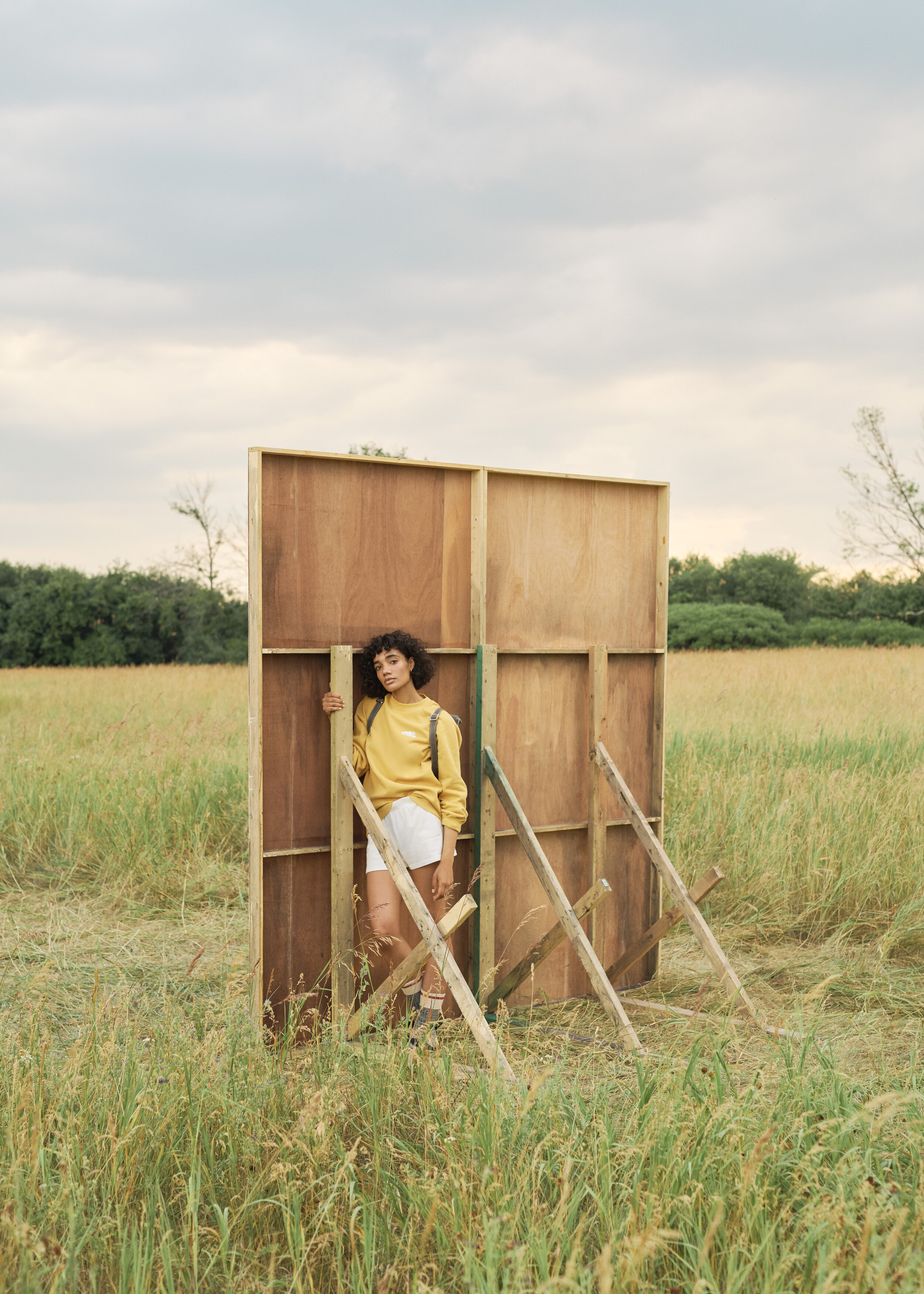
The Cooper Pop campaign was born from a specific graphic optimism: How do we evolve a core athletic heritage into a premium, high-concept narrative for a back-to-school global transition? The objective was to lead an architectural art direction, utilizing monochromatic stages and a "vanish" effect to expose the set's skeleton as a structural frame. By creating a dialogue between intentional artifice and the organic world, I ensured the brand’s visual language remained disciplined.
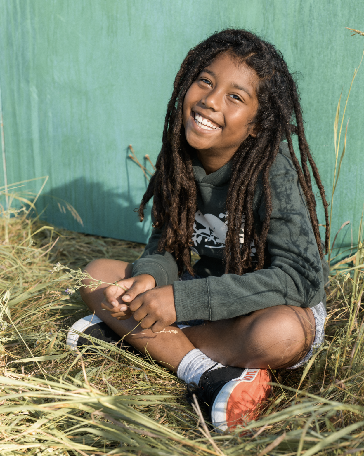
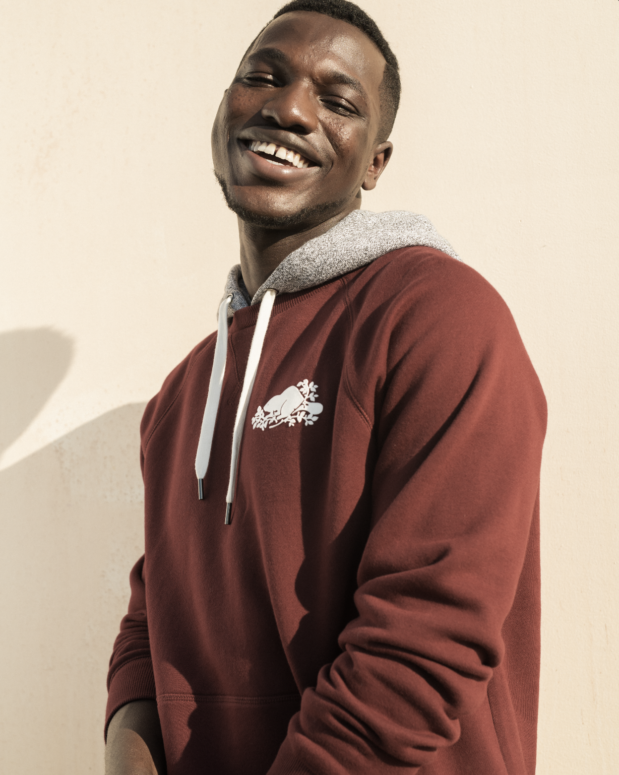
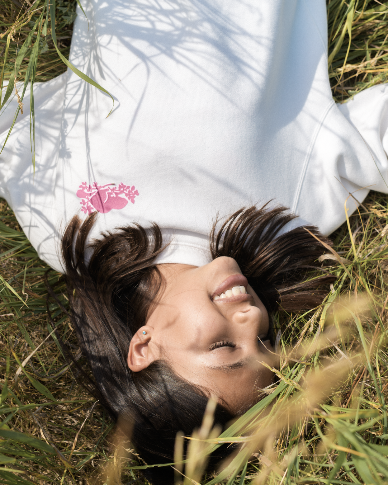
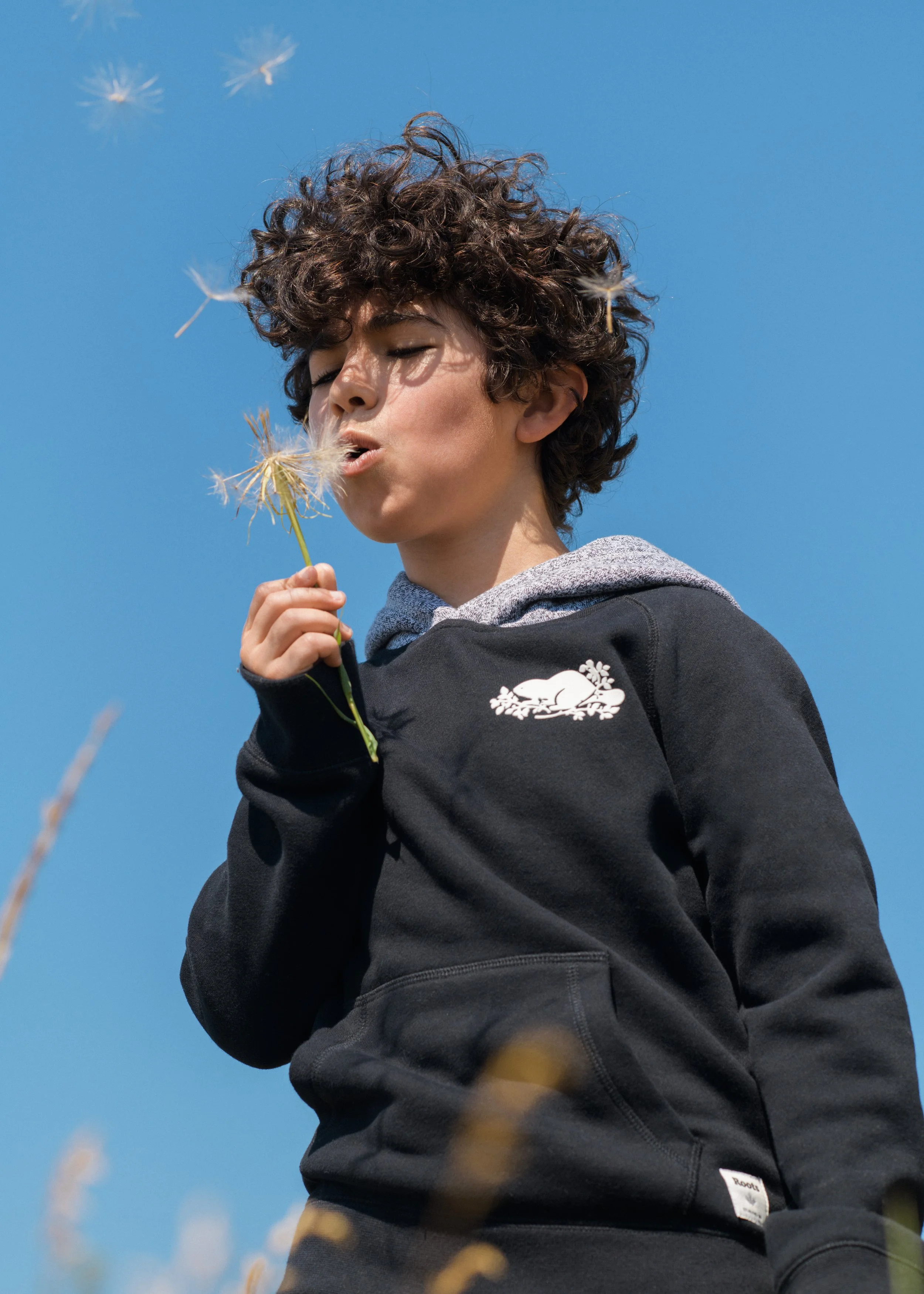
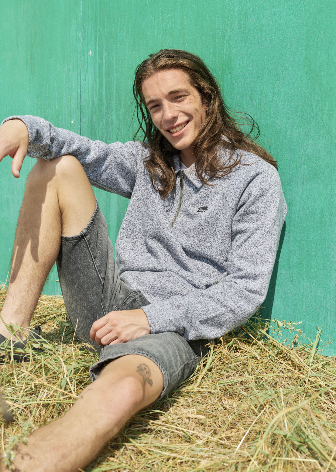
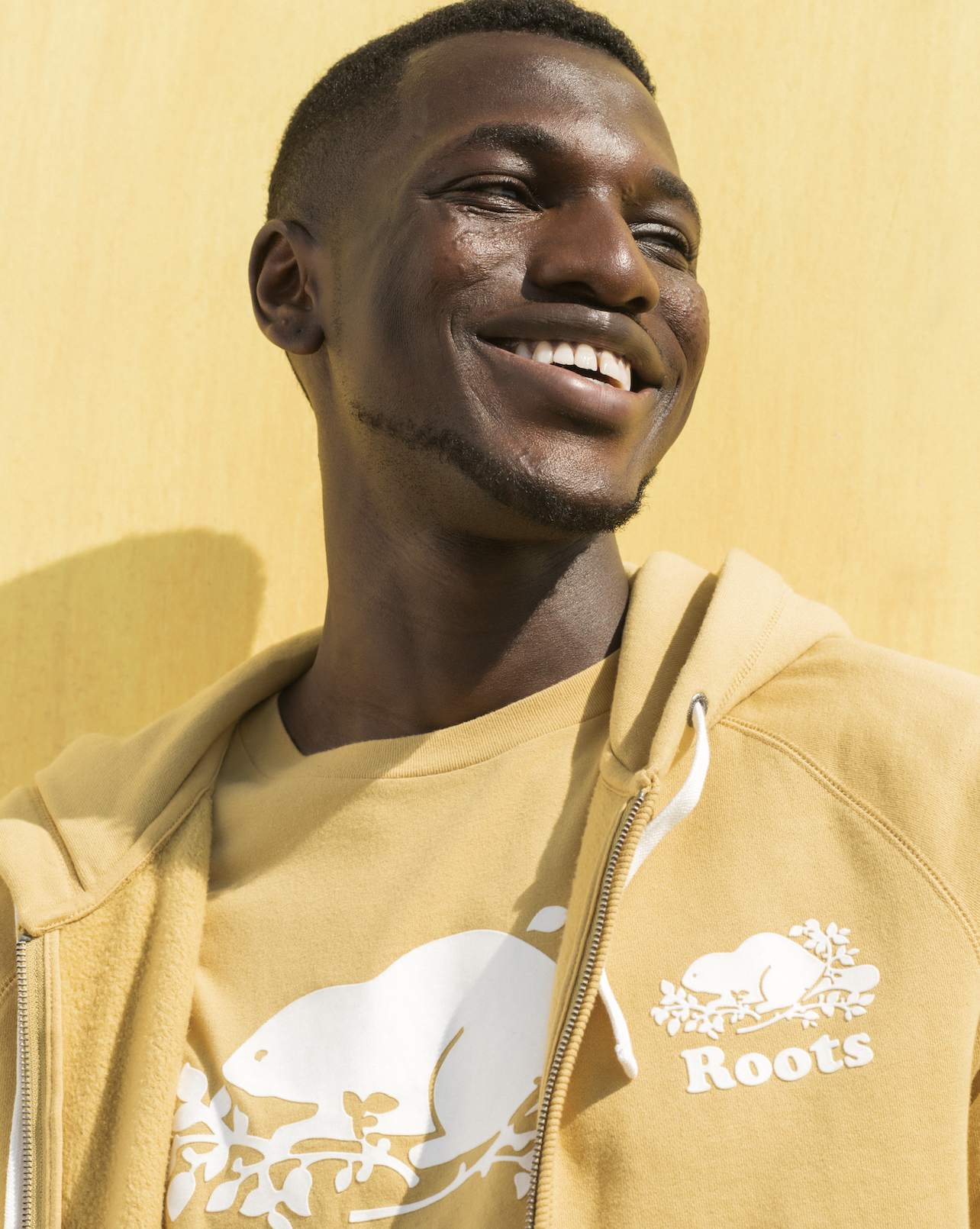
As Creative Director, I orchestrated a "studio-in-the-wild" narrative, seeking an expansive, sun-kissed feel to capture the end of the summer. By utilizing a monochrome-on-monochrome technique, I matched hand-painted backdrops to the exact mustard and forest hues of the garments. I directed a diverse cast to achieve a saturated serenity, ensuring every digital touchpoint felt both high-concept and soulful.
Brand: Roots Canada.
Role: Creative leadership, omni-channel strategy, on-set direction, creative concept and brief.
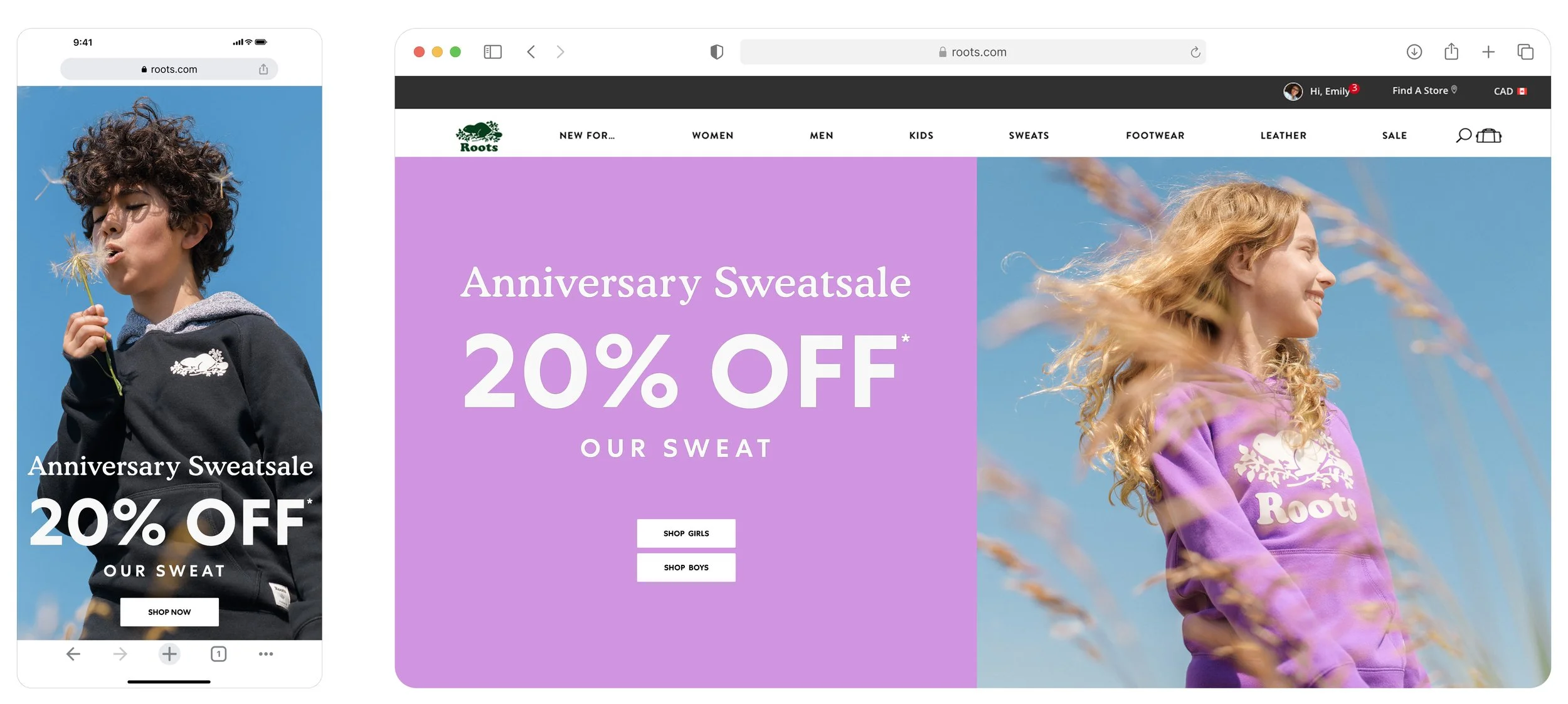
Seen: Roots.com, social channels, emails, in-store and window.
Credits: Photographers: Zach Hertzman.


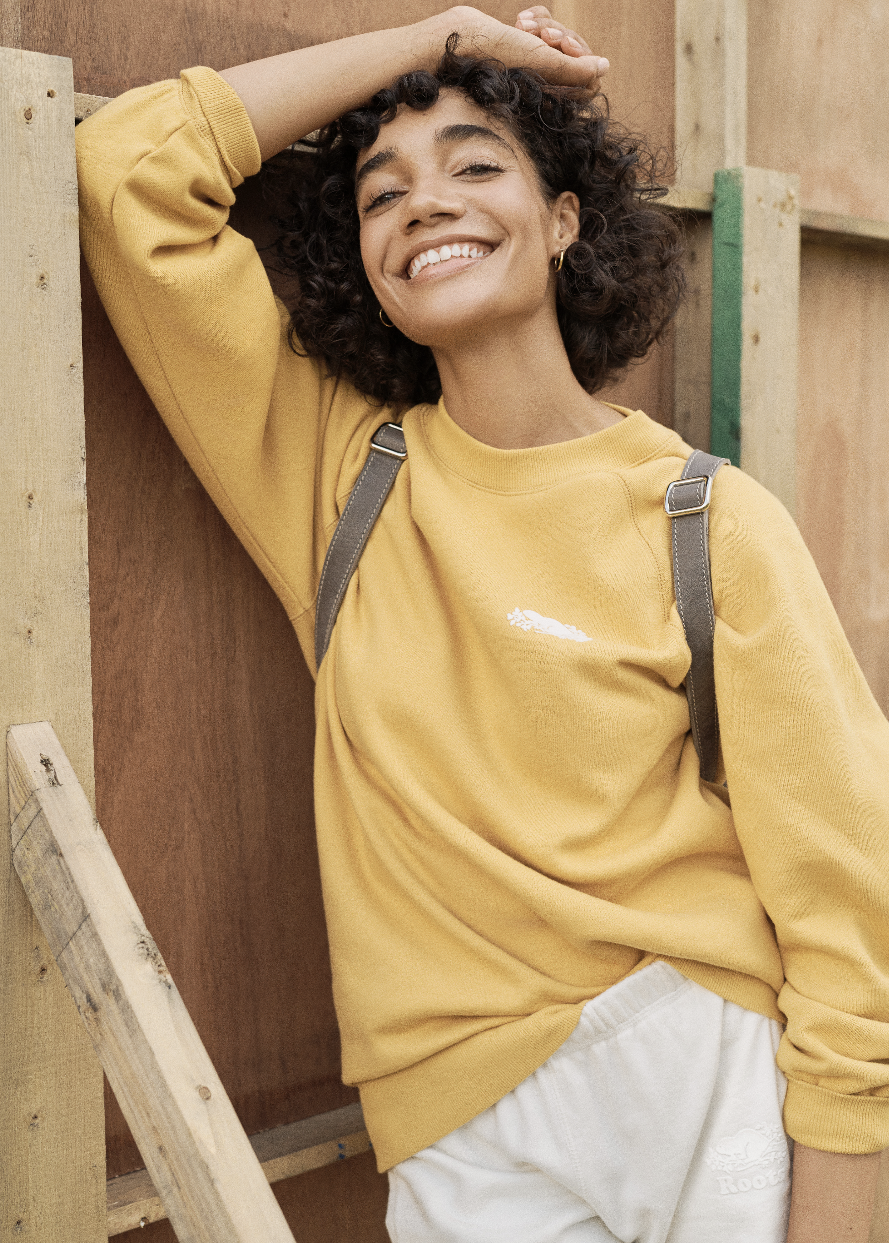


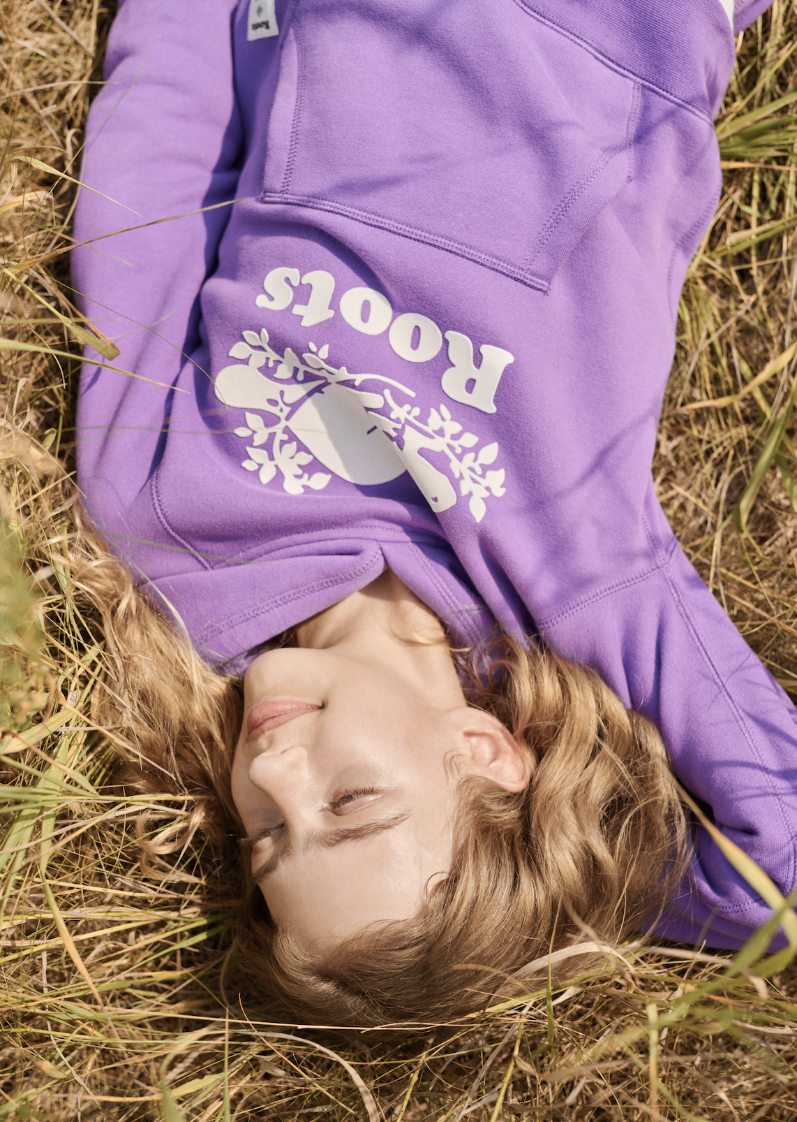
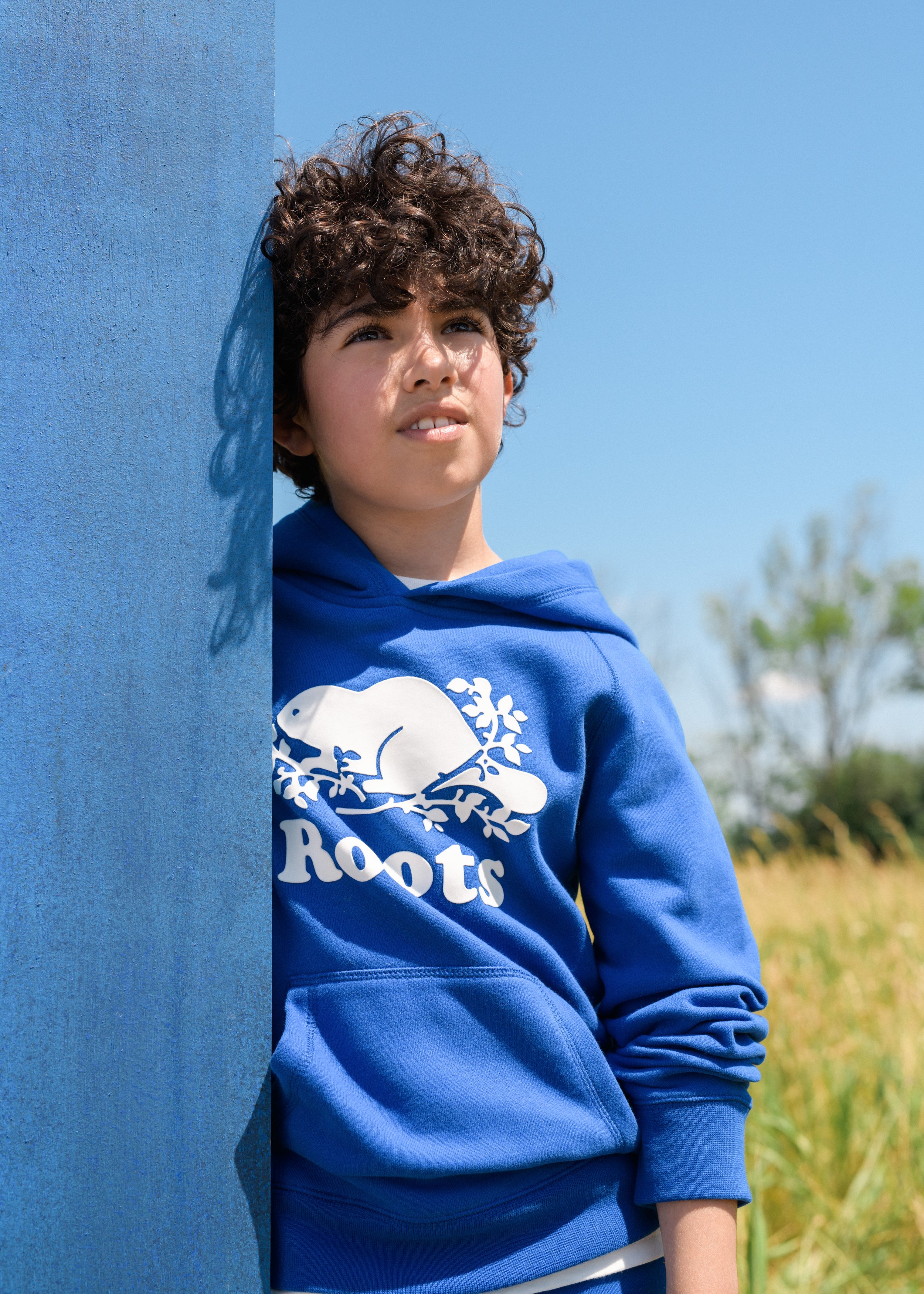

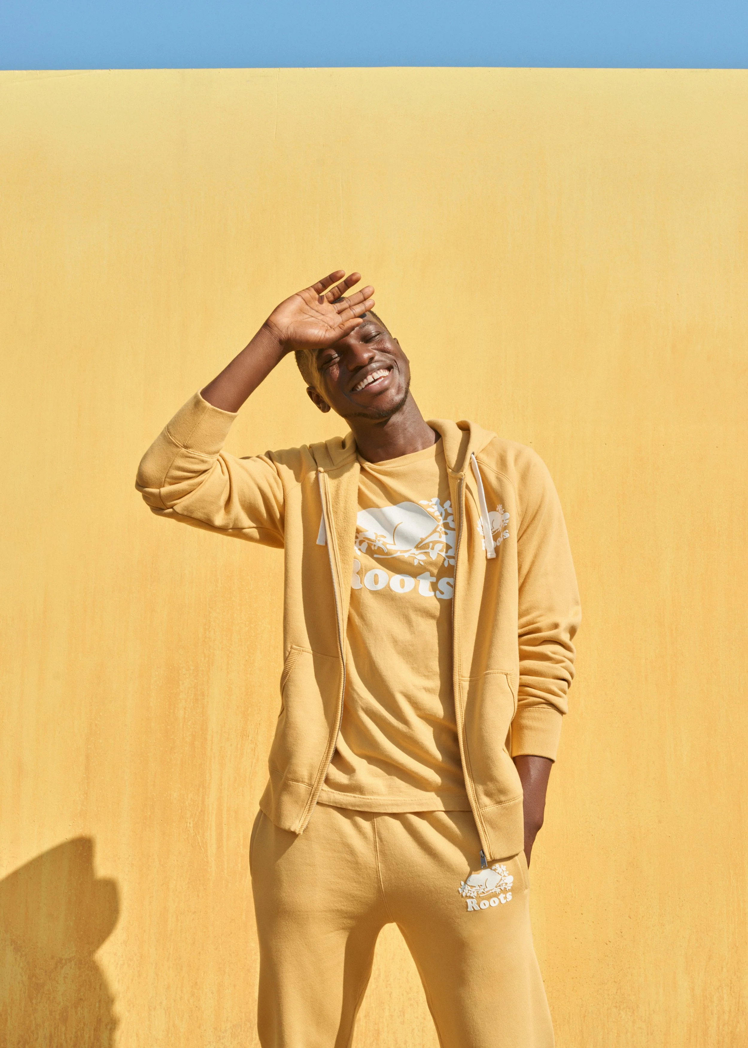
"Optimism is a visual construct. By intersecting the bold, athletic DNA of our heritage with a modernist, graphic editorial aesthetic, we transformed a signature collection into a dimensional study of form and space—celebrating the power of vibrant, saturated colour through a cinematic lens that honours the sophisticated tension between the studio and the open air."
— Campaign Thesis